Introduction
As part of the Maven Tour de France challenge, we have to put ourselves in the shoes of a data visualization expert working for Amaury Sport Organisation, the company that organizes the annual Tour de France cycling race.
The Tour de France is one of the most watched live sporting events in the world, but most viewers come from European countries.
Challenge
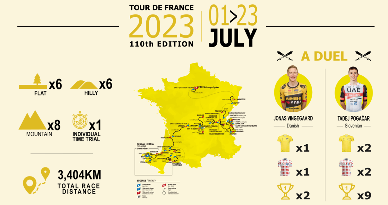
So my aim is to create an infographic-style visual to educate new viewers, highlight the scale of the event and build anticipation for this year’s race. This exercise is an opportunity for me to develop my data visualization skills.
Data
Historical dataset on every Tour de France from 1903 to 2022, including details on the stages, distance, entrants, finishers, and winning times for each year.
Production
To carry out this challenge, I used PowerBi and also Inkscape to create the visuals. Here’s my entry:

